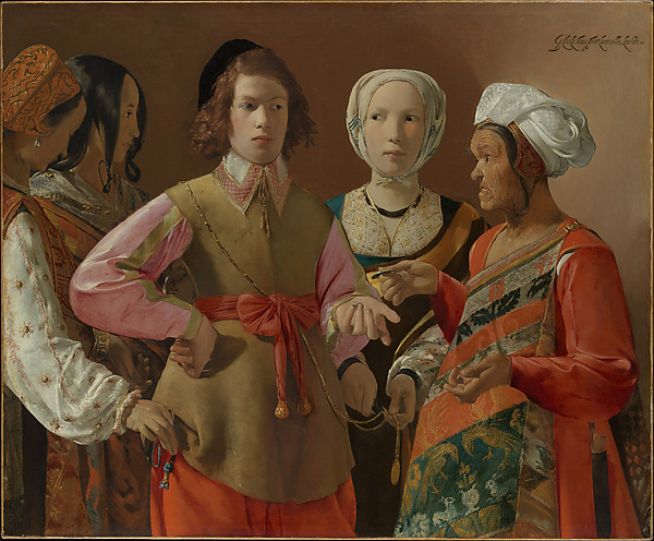
Image title: The Fortune-Teller
Medium: Oil on canvas
Date: probably 1630s
Source:
The Met Collection
“
Thought is the blossom; language the bud; action the fruit behind it.
”
— Ralph Waldo Emerson
The Communist Palette: Color Theory Behind the Iron Curtain
Introduction: Beyond the Greyscale of Ideology
In the crucible of Soviet art, color was never just aesthetic—it was ideological. Each stroke bore the weight of Party expectations, each hue held subliminal messages of revolution, struggle, and triumph. In a world where propaganda intersected with painting, the Communist palette evolved as a coded visual language. From the early days of the Bolshevik Revolution to the late-Soviet stagnation, Soviet artists manipulated color to align with and perpetuate Marxist-Leninist philosophy. This article explores the stages of this chromatic transformation, illuminating how visual art functioned as both weapon and witness under state control.
1. Bolshevik Beginnings: Red as Revolution
Red—the color of fire and blood—reigned supreme in the infancy of Soviet visual ideology. During and after the October Revolution of 1917, Constructivist and Agitprop artists like El Lissitzky and Alexander Rodchenko harnessed red to symbolize emancipation and collective power. In posters and murals, red often overwhelmed compositions, signaling both urgency and transformation, in contrast to the black-and-white backdrop of Tsarist oppression.
Technologically, advances in lithographic printing enabled mass production of vivid red posters, making revolutionary messaging omnipresent. Philosophically, red became synonymous with dialectical materialism: a constant, dynamic force. Even typography in propaganda took on red tones, unifying all elements into a single ideological shout.
2. The Grey of Struggle: War and Monochrome Patriotism
The outbreak of World War II and the Great Patriotic War heavily influenced Soviet color theory. The palette turned somber—greys, browns, and army greens dominated artworks as the context demanded sobriety and sacrifice. War posters by artists like Irakli Toidze used stark contrasts: blood-red banners juxtaposed against grayscale images of soldiers and ruins. This chromatic shift reflected the existential gravity of the era.
Culturally, color was stripped down to essentials, mirroring rationed resources and austere living. This minimalist approach underscored resilience rather than opulence, positioning grey not only as a visual style but as a metaphor for endurance amid hardship.
3. Blooming Reds and Harsh Yellows: Socialist Realism’s Visual Vocabulary
Stalin’s cultural policies in the 1930s and 1940s ushered in the era of Socialist Realism—the mandated art style for all Soviet creatives. It retained red as central but enhanced the palette with bright, optimistic colors. Golden wheat fields, azure skies, and glowing skin tones conveyed a utopia already achieved—or on the horizon. Color became a tool for myth-making and emotional programming.
Key examples include Alexander Gerasimov’s portraits of Stalin bathed in heroic light, with crimson flags and radiant sunlight adding weight to constructed narratives. The visual consistency across murals, posters, and even domestic textiles created a controlled chromatic environment, encouraging ideological cohesion from home to factory.
4. Khrushchev’s Thaw: Pastels and Experimentation in the Margins
The post-Stalinist ‘Khrushchev Thaw’ of the 1950s and 60s loosened some artistic constraints. While Socialist Realism remained dominant, subtle shifts in tone appeared in state-sanctioned and underground art. Artists began to reintroduce softer palettes—pastels, earthy tones, and expressive brushwork—both discerning and discreet in their intent to humanize rather than idealize.
Technologically, the advent of new acrylic paints and improved canvases allowed for greater breadth of expression. Culturally, the import of Western abstract and expressionist styles—albeit censored—led to an understated rebellion through color: less saturated, more introspective. The color spectrum widened, reflecting a society negotiating between control and change.
5. The Aesthetic of Decline: Color in the Era of Stagnation
From the 1970s through the 1980s, the Soviet Union entered what many historians call the Era of Stagnation. Art reflected this malaise—palettes dulled, repetition increased, and even optimistic scenes were translated into washed-out hues. Soviet Nonconformist artists like Erik Bulatov and Ilya Kabakov subverted traditional Socialist Realist techniques by pairing monumental color schemes with themes of isolation and decay.
This period also saw the technological proliferation of photography and television, shifting how Russians consumed images and colors. Mass media’s influence created a dichotomy: on official channels, color retained symbolic power; in underground studios, it became a tool of irony and existential critique. Thus, red transformed from revolutionary fire into a flickering ember of a fading ideology.
Conclusion: Chromatic Legacies
The legacy of the Communist palette endures in both post-Soviet art and collective memory. Every brushstroke from those decades carries a dual function—as artistic statement and ideological code. Color under the Iron Curtain was never incidental—it was systematically mobilized to affirm, conceal, and occasionally challenge the narrative of one of the 20th century’s most formidable regimes. Understanding this visual language not only enriches our appreciation of Soviet-era art but also unveils how color can become both a prison and a pathway of expression.

Image description:
“Unity of humanitarian and technical sciences” constructivist relief at 46, Chkalovsky avenue. Petrogradsky District, Saint Petersburg, Russia.
License:
Public domain
Source:
Wikimedia Commons
Useful links: